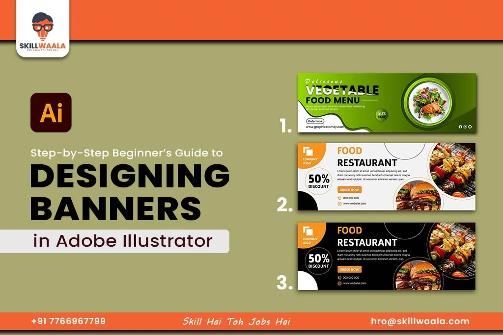
In today’s digital world, banner design plays a crucial role in event posters, online ads, and social media promotions. A well-designed banner can capture attention, convey messages clearly, and drive action.
But effective design is not just about making things look good. It is about visual communication. Adobe Illustrator is one of the most powerful tools for creating professional, scalable, and pixel-perfect banners, and you can learn it through the free graphic design course by SkillWaala.
In this blog, we will explore how to design banners in Adobe Illustrator, understand key principles like hierarchy and balance, and also learn how to work with the grid system.
Let’s get started.
Understanding Banner Design: Key Principles
First and foremost, it is crucial to understand the basic principles of banner design. A good banner is not just about vibrant colors and unique fonts. It follows key principles that guide the viewer’s eye and emotions. If you are keen to learn, then go through our beginner guide of Adobe Illustrator where understanding all will be simple. Here are some crucial design principles to keep in mind when creating banners.
Visual Hierarchy
Visual Hierarchy refers to the arrangement of elements to show importance to certain objects. You decide what the viewer sees first, second, and last. Here is how you can use visual hierarchy in banners:
- Use larger fonts for headings or offers like ‘50% off.”
- Use bold or bright colors for your call-to-action like “Buy Now”
- Keep less important details in smaller text or subtle colors
Balance for Visual Harmony
Balance in design means your elements do not look crowded on one side or empty on the other. It can be symmetrical (equal on both sides) or asymmetrical (visually equal but not identical). With Illustrator, you can create logo with a simple guide You can follow these points to ensure proper balance in your banners:
- Align elements properly
- Distribute text and images evenly across the banner
- Use similar shapes, colors, and spacing to balance one side with another

Effective Use of Spaces
Do not fill your entire canvas with text or images. Empty space also known as white space helps your design breathe and improves readability. Use these tips to maximize the effective use of space:
- Leave space between text blocks and images
- Do not overuse design elements like icons, stars, or borders
- Use padding around content to separate sections
Read more – Introduction to Illustrator Tools
How to Create Banners in Illustrator: Tools and Techniques
Now that you understand the principles of banner design, it is time to turn that theory into action using Adobe Illustrator, a powerful tool used by professionals to create high-quality banners for both print and digital platforms. Follow these steps to design a banner in Illustrator:
Step 1: Set Up Your Artboard
Create a New Document by:
- File > New
- Choose a Web or Print preset (Digital banners: 1200px x 628 px or 1080px x 1350px)
- Name your file
You can also use RGB color mode for digital banners and CMYK for print
Step 2: Create the Background
The background of the image sets the entire tone of the banner. You can draw a rectangle to cover the artboard and fill it with a solid color, or gradient, or even use a high-quality image. Experiment with different colors and gradients to check how they affect readability.
Step 3: Add Shapes for Structure
Use geometric shapes to create blocks or sections in your banner. You can use tools like
- Rectangle Tool (M)
- Ellipse Tool
- Polygon Tool
You can also create boxes for text, highlight areas for crucial information, or add design flair using curves or lines.
Step 4: Insert Text using the Type Tool
After let’s add your headline, subtext, and call-to-action:
- Select the Type Tool (T)
- Click and type your main message
- Choose a bold font for the heading and a simple sans-serif font for the body text
You can also adjust font size, line spacing, and alignment (left, center, or right)
Step 5: Add Icons or Product Images
The next step is to add icons or product images.
- Use File: Place to import an image of the product or event
- Download vector icons from sites like Flaticon and place them inside Illustrator
- Resize using Shift + Drag to avoid icon or image distortion.
Also, make sure to always use high-resolution, royalty-free images to maintain banner quality.
Step 6: Add Final Touches
Lastly, when you have a design you like, you can start adding the final touches.
- Use the Drop Shadow or Outer Glow effect from Effect > Stylize
- Add borders, dividers, or highlight shapes around important elements
- Make sure to keep enough spacing between sections.
Step 7: Export the Banner
Once you are satisfied with the banner,
- Go to File > Export > Export for Screens
- Choose the file format (PNG for transparent elements and JPG for social media)
- Select the appropriate resolution (72 PPI for web, 300 PPI for print)
Read more – Understanding the Workspace & Interface Overview
How to Work With Grid Systems?
One of the biggest differences between amateur and professional design is alignment and that is where the grid system comes in. A grid helps you place elements (text, images, shapes) in a way that looks clean, organized, and visually balanced. Let’s learn how to use grid layouts inside Adobe Illustrator to design banners that are both aesthetic and aligned.
A grid system is a set of invisible horizontal and vertical lines that guide your layout. It ensures:
- Consistency in spacing
- Perfect alignment of elements
- Balanced composition
Step 1: Enable the Grid in Illustrator
To turn on the grid:
- Go to View > Show Grid
- Go to View > Snap to Grid
You will see a dotted mesh overlay across your artboard. Customize the grid spacing via Preferences > Guides & Grid and set it to suit your banner sizes.
Step 2: Use Rules and Guides
For a more precise layout:
- Press Ctrl + R to enable rulers
- Click and drag from the ruler onto the artboard to place guides
After that, use these to mark edges/margins, center lines, and columns for multi-section designs. This will make your banner look neater, aligned, and professionally structured.
Step 3: Apply the Rule of Thirds
If you want to make your design naturally appealing, use the rule of thirds. Divide your artboard into 3 equal parts both vertically and horizontally. Place key elements like the headline, CTA, or product image where these lines intersect. This classic photography and design rule helps guide the viewers’ eye.
Step 4: Align Using the Align Tool
- Select all objects you want to align
- Go to Window > Align
- Use options like Align Left, Center, Distribute Spacing, etc.
This is especially helpful when spacing out icons or text elements evenly across your banner.
Step 5: Use Smart Guides for On-the-Go Alignment
Illustrator’s Smart Guides show pink lines as you move objects around, helping you align them with nearby elements. To enable:
- View > Smart Guides
Graphic design, animation, and video editing are often learned together. Although they might be completely different skills, the one who possesses all three stands out in the competition. Register for our free online animation course for beginners to bring stills to life through your creativity.
Or if you want to captivate your audience with amazing video edits, you should sign up for SkillWaala’s free online video editing course.

Final Words
Banner design is more than just putting text and images together, it is about creating visual communication that connects with people. With the tools and techniques you have learned in this session, you are now equipped to design banners that look clean, balanced, and impactful. Also, keep in mind that constant practice and experimenting are the key to mastering Illustrator.
If you are someone who wants to learn design principles and the entire suite of Adobe Editing Tools, you can enroll in Skillwaala’s Free Animation course.