If your video looks flat, dull, or “off,” chances are it’s not your camera; it’s your color workflow. Colors are a huge part of how your video feels. They control the mood, the emotion, and even how professional your final output looks, and that’s precisely where color correction vs grading becomes essential. These two steps may sound similar, but they do entirely different jobs. Understanding them correctly is what separates amateur-looking edits from polished, cinematic visuals.
This guide gives you a complete video color tutorial to build a strong foundation and a straightforward, step-by-step workflow you can follow, no matter what software you use. Whether you’re a beginner editor, a film student, a YouTuber, or someone leveling up your professional editing skills, this guide will make color easier to understand.
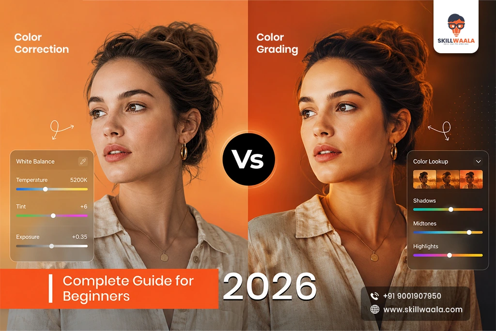
What Is Color Correction?
This is where color grading basics come into play, adding your style, mood, and creative choices. Color correction is the first stage of the color process. Think of it as “fixing what’s broken.” Every camera captures light differently, and shooting conditions are rarely perfect. Color correction helps you fix all the small issues in your footage so that it looks natural, balanced, and consistent.
What color correction usually fixes:
- Wrong white balance
- Exposure issues (too bright or too dark)
- Colors that look too cold, too warm, or inconsistent
- Washed-out skin tones
- Underexposed shadows or blown-out highlights
The goal is simple: make your footage look accurate and true to real life.
If someone paused your video and looked at a frame, they shouldn’t notice any weird color problems.
Color correction is a technical process, and it’s all about accuracy. Before you do anything creative, before LUTs, before you try to make the video “cinematic,” you need to correct it.
Read More: Best Free Video Editing Software for Students
What Is Color Grading?
Once your footage is corrected, you start grading. Color grading is where you add your style, mood, and creative choices. This is the fun part—the part that creates a vibe.
What color grading helps you achieve:
- A warm sunset aesthetic
- A moody, dark, high-contrast look
- Teal-and-orange cinematic tones
- Vibrant travel vlog style
- Soft pastel look for lifestyle content
- Professional film-like visuals
Grading is not about fixing anything. It’s about designing an emotional experience. Two videos with the same footage can look completely different depending on the grade. Color grading is where your personality as an editor shows up.
Read More: Latest Video Editing Trends in 2026
Key Differences (Correction vs Grading)
Many beginners get confused between the two, to understand the difference between color correction and color grading, here’s a simple breakdown:
| Color Correction | Color Grading |
| Fixes mistakes | Creates a style |
| Makes footage natural | Makes footage beautiful |
| Technical | Creative |
| Must be done first | Always done second |
| Balances exposure & white balance | Adds contrast, tones, artistic looks |
A simple example: If someone’s skin tone looks green because of bad lighting, you fix that during correction. If you want their skin to look warm and golden, creating a dreamy vibe, that’s grading. In short, both are necessary and both can work together.
Also Read :- Top Video Editing Skills
Tools You’ll Need (Resolve, Premiere, Lumetri, CapCut)
You can do color work in almost any editing software, but some tools make the job much easier:
Desktop Editing Tools
DaVinci Resolve (Free & Studio)
- Best color tools in the industry
- Professional scopes, wheels, and curves
- Used by Hollywood films
Adobe Premiere Pro + Lumetri Color
- Great for editors who already edit in Premiere
- Color wheels, curves, and LUTs built in
- Easy to learn for beginners
Final Cut Pro (Mac)
- Smooth performance with Apple Silicon
- Good for quick color work
- Beginner-friendly
Mobile & Creator Tools
- CapCut
- VN Video Editor
- LumaFusion (iPad)
These are simple but powerful enough for basic correction and grading. If you are a beginner, consider them.
Essential Color Tools to Learn
- Color wheels
- Curves
- White balance sliders
- LUT panel
- Scopes (waveform, vectorscope, histogram)
Once you understand the tools, the workflow feels much easier, and the process becomes seamless.
Read more – Common Video Editing Mistakes and Fixes
Step-by-Step Workflow
A good workflow prevents confusion and keeps your colors consistent across your whole video. Whether you’re editing a YouTube vlog or a short film, use this order:
- White Balance
- Exposure correction
- Contrast & saturation adjustment
- Apply LUT (optional)
- Creative grading
- Final touches (skin tones, highlights, shadows)
Beginners often jump straight to LUTs or creative looks, but that usually ruins the footage. Correct first, then grade later.
White Balance
White balance is the foundation of everything and directly influences your overall color balance. If your white balance is wrong, everything else falls apart, especially the skin tones.
Signs of wrong white balance:
These are the signs that your white balance is wrong:
- Footage looks too blue (cool)
- The footage looks too orange (warm)
- Skin tones appear green or magenta.
How to fix it:
- Use the WB eyedropper tool on a white or gray surface.
- Adjust temperature (cool ↔ warm)
- Adjust tint (green ↔ magenta)
Pro Tip:
If you can, use a grey card while shooting; it makes correction unbelievably easy.
Exposure
Incorrect exposure is one of the biggest reasons videos look unprofessional. Good exposure ensures your video has proper brightness, preserved details, and clean shadows.
How to adjust exposure properly:
- Use the waveform to check brightness levels
- Lift or lower shadows.
- Adjust highlights to avoid clipping
- Control midtones for natural skin
Fix problems like:
- Dark shadows that hide details
- Overexposed faces
- Blown-out skies
Exposure gives your footage life, and once exposure is correct, your video immediately looks cleaner and more expensive.
Contrast & Saturation
This is where your image starts getting a shape:
Contrast
- Contrast defines how powerful your darks and lights look. If you put in too little contrast, you’ll end up with flat, dull footage; too much contrast results in harsh, unrealistic visuals. You can use curves or color wheels to adjust the contrast with more control.
Saturation
Beginners often overdo saturation because it makes things look eye-catching. But you have to understand that too much saturation usually comes across as amateurish, and doing too little makes it look lifeless. You should aim for natural, more consistent tones, while keeping in mind that the tones should always be slightly less saturated than the rest of the frame.
LUT Application
LUTs (Look-Up Tables) are like color presets; they can instantly give your video a specific look. But they’re not magi, they work properly only after you correct the footage.
Two types of LUTs:
- Technical LUTs
- Used for Log footage
- Converts flat profile → normal Rec709 colors
- Creative LUTs
- Adds a specific look or mood
- Film look, warm look, teal-orange, moody, vintage, etc.
How to use LUTs properly:
- Never apply a LUT at 100%
- Bring it down to 20–60% for natural results
- Adjust highlights and shadows after applying a LUT
LUTs should enhance your grade, not overpower it.
Creative Looks
This is where color grading gets expressive. Creative grading depends on what story you’re telling.
Popular Looks You Can Try
- Cinematic teal & orange for films and travel
- Warm, cozy tones for lifestyle, food, cafés
- Cool, moody vibes for music videos and edgy content
- High-contrast, punchy look for fitness or tech videos
- Pastel soft tones for weddings and aesthetic reels
Tools to shape creative looks:
Here is the list of tools that you can use to shape your creative looks:
- Curves (especially hue-vs-hue and hue-vs-sat)
- Vignette
- Color wheels
- Masks for faces or backgrounds
- Highlight balance
Pro Tip:
Keep it subtle. If your audience notices the grade more than the content, it’s too much.

Common Mistakes to Avoid
Even experienced editors fall for these traps:
1. Over-saturation
Colors start looking neon and unrealistic. This shift can diminish the natural appeal of the scene. Understanding the impact of color saturation is essential for effective design.
2. Crushed blacks
Details in shadows disappear completely. The darkness envelops everything, leaving no trace of form or color. Silent and absolute, it dominates the space.
3. Clipped highlights
White areas lose texture, especially in the case of sky and skin.
4. Applying LUT before correction
LUTs look terrible when applied to uncorrected footage. This can result in distorted colors and poor image quality. Proper correction is essential for accurate color grading.
5. Ignoring scopes
Your screen may lie, scopes never do. In the realm of precision, only direct examination guarantees truth. Trust in observation over assumption.
6. Using the same grade on every clip
Always match shots before applying a final grade. This ensures consistency across the footage. Proper shot matching is crucial for seamless grading transitions.
Avoiding these mistakes instantly boosts the quality of your work.

Free LUT & Color Resources
There are numerous places to find free, high-quality LUTs and color learning materials:
Free LUT sources:
- YouTube creators
- DaVinci Resolve website
- Camera brands: Sony, Canon, Blackmagic
- Color grading communities on Reddit and Discord
Types of LUTs you can download:
- Cinematic film LUTs
- Log to Rec709 LUTs
- Travel vlog LUTs
- Wedding LUTs
- Moody teal/orange LUTs
Always test LUTs before using them professionally. This ensures compatibility and prevents potential issues. Proper testing helps achieve the desired results efficiently.
AI-Based Color Tools in 2026
AI has exploded in color workflows, especially for beginners. It doesn’t replace skill, but it speeds up the process.
2026 AI color features include:
- Auto color matching between cameras
- One-click white balance correction
- Auto exposure adjustments
- AI-based skin tone isolation
- Scene-by-scene color consistency
- AI suggestions for creative looks
Tools like Resolve and Premiere now use AI to speed up workflows, but the final artistic decisions still need a human touch. AI can guide you—but you decide the mood.
Conclusion
Color correction and color grading are two different but equally essential steps in making your video visually powerful. Correction makes your footage look natural and accurate, while grading gives it personality and emotion. Always correct before you grade—this single rule will improve your results overnight.
Once you understand white balance, exposure, contrast, and LUTs, creative grading becomes genuinely enjoyable. Experiment with different looks, try out LUTs, study films you admire, and build your own presets. The more you practice, the easier it becomes to create consistent, beautiful colors that reflect your unique style.
Remember, color isn’t just technical, it’s a storytelling tool. Use it well, and your videos won’t just look better, they’ll feel better.

FAQs
Ans. Yes. Resolution and Log footage don’t fix lighting issues. The log actually requires correction because it comes out flat. Correction is what makes it natural, and grading makes it cinematic.
Ans. If you’re new, start with CapCut or Premiere Lumetri. Once comfortable, move to DaVinci Resolve, which is the industry standard for professional color grading.
Ans. Always after correction. Applying LUTs to uncorrected footage usually makes colors look distorted, unnatural, or overly saturated.
Ans. Because the base correction isn’t matched. You must match exposure, white balance, and contrast between shots before adding your creative grade.
Ans. Use tools like hue vs. hue, hue vs. sat, or the skin tone line on the vectorscope. Don’t oversaturate. Keep highlights soft and monitor skin tones separately.
Ans. AI tools help with base correction (white balance, exposure, matching shots), but they can’t replace your creative intent. They speed up the workflow, but human grading is what gives emotion and storytelling.